Why most dental websites make patients nervous
Dental websites are supposed to build trust. Most of them do the opposite. Stock photos of perfect teeth, hidden pricing, and aggressive popups are making anxious patients click away.
Going to the dentist already makes people nervous. You'd think dental websites would go out of their way to be calming. Reassuring. Honest.
Most of them do the exact opposite.
The stock photo teeth
A homepage banner with a model grinning at the camera. Impossibly white, perfectly straight teeth. Looks like a Colgate ad, not a dental practice.
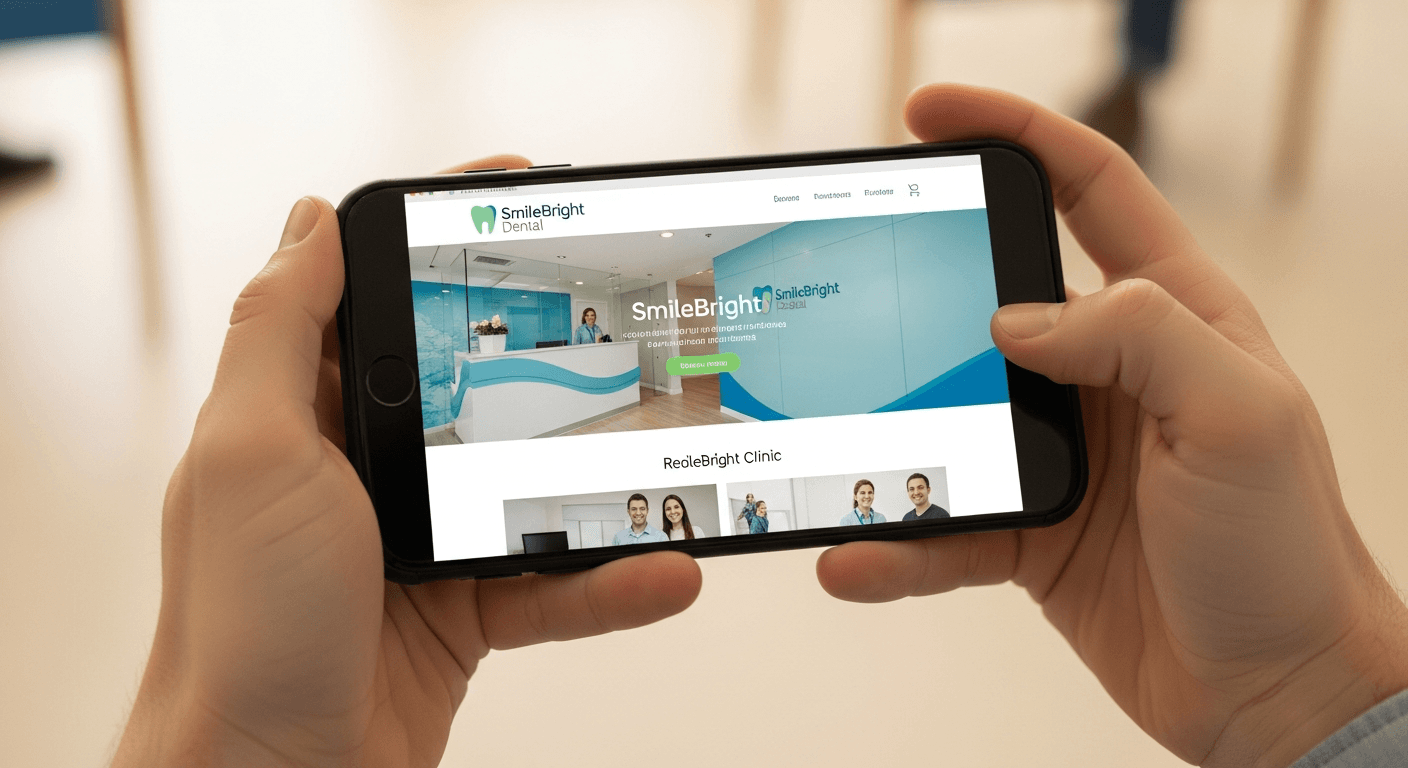
The patient thinks: "That's not real. This place is trying to sell me something." They came scared about a toothache. Now they feel marketed to. You know what actually works? A real photo of your reception area. Your actual team in your actual clinic. Even if the lighting isn't perfect. Patients want to see where they're going, not a stock photo catalogue.
Who's going to be looking inside my mouth?
That's what the patient's thinking. It's a deeply personal thing. When I land on a dental site and the team page has cartoon avatars and first names only, I know that practice is losing patients to the one down the road with an actual photo of Dr. Sarah in her scrubs and a paragraph about her experience.
People book with people. Anonymous site = risky feeling.
"It's going to be expensive and they're hiding it"
That's what patients think when they can't find a single price. I know treatments vary. I know you need to assess first. Valid clinical reasons. But the patient doesn't care about your reasons.
Starting-from prices for common stuff — check-ups, cleanings, fillings. That's all you need. It says: we're not trying to surprise you. The practices that list even rough ranges get more bookings, not fewer. Because people who call already know what to expect.
The ambush popup
Landed on a dental site last week. Three seconds in, popup covers the entire screen: "BOOK YOUR APPOINTMENT NOW!" Form demanding my name, phone number, preferred date.
I hadn't read a single word. Didn't know what they offered. Didn't know if they were any good. And now there's a form in my face. For someone already anxious about a dental visit, this is the opposite of welcoming. It feels like a sales funnel, not a healthcare provider.
What actually converts
The dental sites that get the most bookings aren't the flashiest. They're the ones that feel honest.
- Real photo of the clinic or team on the homepage
- What you do and where you are — above the fold, no scrolling
- Staff profiles with actual photos and short bios
- Starting-from prices for common treatments
- Google reviews from real patients — especially the ones mentioning they were nervous and it went fine
- Booking button in the header. Not a popup. A button.
None of this is complicated. It's just rare.
Your patient isn't judging your grid layout. They're deciding whether they trust you enough to sit in your chair and open their mouth. Build your site for that person.
Written by JJ
OWAO Consulting
Free clinic audit
Want to know exactly where your clinic is losing patients online?
I’ll audit your GBP listing, your website conversion path, your review profile, and your local search visibility — and send you a specific report on what to fix first.
Request Your Free AuditNo call required. Report delivered by email within 48 hours.